Creating Mobile Versions of an Email Message
How to Create a Mobile Version of an Email Message
Getting Started
To create a version of your message that will be seen only on mobile devices, open the second tab of the message editor, called Mobile Message. Insert your content into the message editor like you would for the desktop version.
If the Mobile Tab is left blank, the desktop HTML Message will show on desktop and mobile devices. Only use the Mobile Message tab if you want to create a unique version to make the message easier to read on mobile devices.
If a message is created using a template, that template must have an editable content region set up in the Mobile tab. Otherwise, the mobile tab will not be editable.
Best Practices
Copy Content from Desktop Version into the Mobile Version
If you leave the message blank in the Mobile Message tab, mobile devices will receive the email from the HTML Message tab, too. When creating a different version for mobile devices, you can use this option to replace the mobile version with a copy of the desktop version. To copy the HTML message and paste it into the mobile message:
- Click the Options button
- Click Create Mobile from HTML
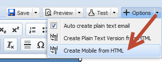
- Edit the content in the Mobile Tab so that the mobile version is different from the desktop version and click Save
Preview
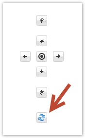
After creating the mobile version, click the refresh icon and navigation arrows to preview approximately how the message will look on an iPhone. Click the center circle button to center the iPhone preview.
Use Template Blocks
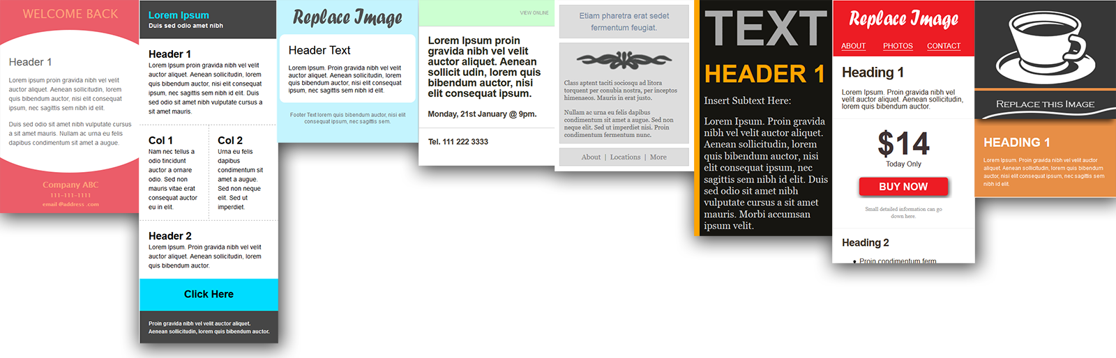
Template blocks are a great way to quickly create a mobile message. You’ll be able to insert predesigned templates, layouts, and content regions.
- Click the
 icon in the Mobile Message tab message editor toolbar
 - Select a simple layout or a designed mobile template like shown below:
- Edit the content and you’ll be ready to go. Please also review the Mobile Guidelines and Known Issues below.
Mobile Design Guidelines
Mobile Design Layouts
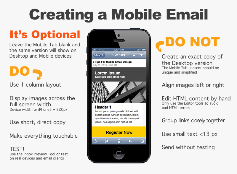
Most of the successful mobile layouts are reduced to a one column layout. If the desktop version has multiple columns, consider positioning them vertically on top of one another. The image below shows how you would want to move a left navigation column to the top of the one column mobile layout.
Making it “Touchable”
Since users will be using their fingers to click buttons and links, you should think about making buttons large enough to touch easily. A good sized click-able area is 44×44 pixels. If you use a 32×32 pixel image, try to surround it with 12px of padding.
Screen Size
The iPhone 5 has a width of 320px and a screen has to have a width less than 480px to display the mobile message. Therefore it’s suggested that you use percentages, such as a width of 100%, in order to scale with various mobile devices.
Mobile Message Editor Tips
Image Size
If the estimated iPhone preview shows that the message runs way past the right side of the screen, even after you set the width to 100%, please look at the image sizes in the message. If they have a width of 600px from your desktop version, resize the images to a smaller width such as 320px.
Background Colors
When a colored background is applied to the body tag of the desktop version, the body of the mobile version will also appear in this color. To use a different background color for the desktop and mobile versions, don’t put a background color style in the body tag. Instead, place tables with widths of 100% inside the two versions and add a background color to each table.
Text Handling
Font Size
Some mobile devices resize text automatically. To prevent this on mobile devices, you can add this to your embedded style:
<style>* {-webkit-text-size-adjust: none}</style> |
Or you can also control text on a case by case basis by adding the following inline CSS:
<font style="-webkit-text-size-adjust: none">Example</font> |
Sometimes other devices such as Androids will display text as a slightly different size. To be safe, make sure that your design is flexible enough to accommodate for a 3% increase or decrease in your font sizing throughout your entire email for optimal results on the Android.
Stop iPhones From Underlining Dates, Phone Numbers, and Addresses
The iPhone will automatically create a link around dates, phone numbers, and addresses in an email message. To prevent this, add the following style to the header of your email. Then surround the text with this class.
<!--Place this style in the header--><style type=""text/css"">.appleLinksWhite a {color:#ffffff; text-decoration:none;}</style><!--Insert this class around the text--><span class="appleLinksWhite">TEXT</span> |
Known Issues with Mobile and Desktop Emails
Here are some known issues with the HTML and Mobile versions, as well as ways to work around them. We also suggest creating a version of your email in the Mobile Message tab that is very simple to avoid other issues.
Images
When an image in the Mobile tab has an assigned alignment property, it will show below the desktop version when viewed in some email clients like Outlook 2013.
<img align="right" ...> |
To fix this issue, please take out the align=”right” or align=”left.” You could also consider making the image appear across the whole width of the mobile device.
Tables
If there is a table in the Mobile tab with multiple rows, but a varying number of cells per row, the table may show. The height of the table will show as a short block colored with the background color of the table.
In this example, the inner table has two rows. The first has one cell that spans over 3 columns, and the second row has one cell that spans over 1 column. Since this is technically an invalid layout for a table, this will cause a block to show with the color red (#FF0000) at the bottom of the desktop version in some email clients.
<table bgcolor="#FF0000" border="0" cellpadding="0" cellspacing="0" style="color: #000000; "> <tbody> <tr> <td width="14"> </td> <td width="408"> <table border="0" cellpadding="0" cellspacing="0"> <tbody> <tr> <td colspan="3"> </td> </tr> <tr><td> </td></tr> </tbody> </table> With new: TODAY! <p> </p> </td> </tr> </tbody> </table> |
Hint: To fix the example above, you’d want to take out the colspan=”3″ to make the table have one column in the first row and one column in the second row. Alternatively, you could add two more table cells to the second row to make it 3 columns on top of 3 columns.
Forwarding and Replying Breaks Media Queries
If an email with a mobile and desktop version is forwarded, both versions will show. Many email clients/applications will forward your HTML email and keep the formatting completely in tact. However, some programs will break the code used to generate the original email, causing it to appear in the new recipient’s inbox with both desktop and mobile versions. In some cases it’s not even the email client that’s breaking the forwarded email, it’s the email server.
To allow your subscribers to forward the email that they receive, please use the Forward to a Friend link. This merge field links to the Forward to a Friend form which allows your subscribers to send the original email to a friend.
Please be aware that email clients and standards are constantly changing, so emails should be thoroughly tested before being sent out.
Contact our Sales and Support Teams at (866) 271-5908 with questions or for more information on mobile email versions.